A new moment begins
A redesign of an existing identity after the partnership changed shape. The firm needed to look different without looking new. Enough continuity that clients still recognized it, enough of a shift that it belonged to the current partners.
Branding
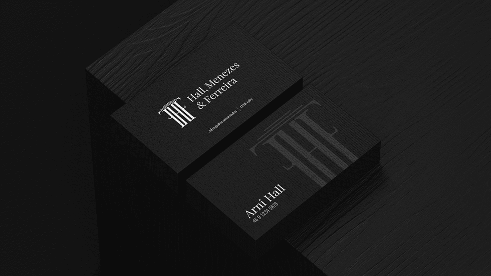
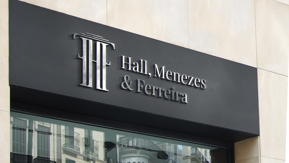
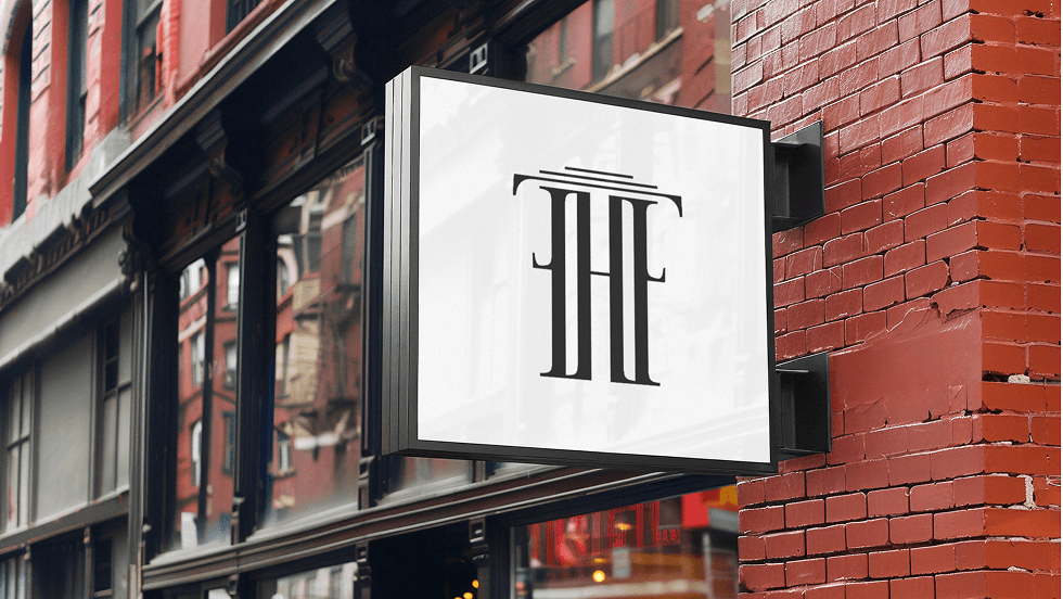
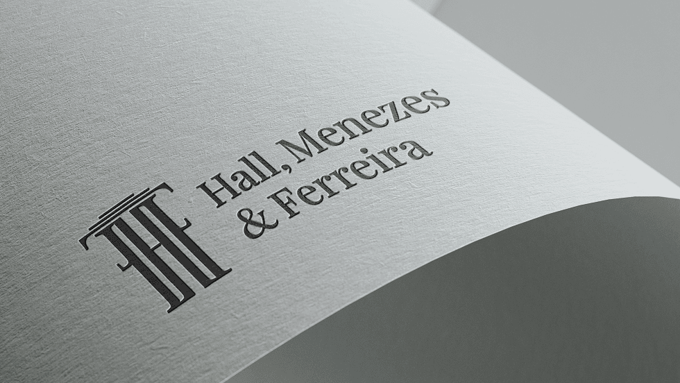
The logo folds three things into one shape: a Greek column for the tradition the work sits in, an araucaria for where the firm is from, and the partners' initials, H, M and F. Three ideas, one form, and you still read it as a law firm without anyone explaining it.
Website
Site rebuilt around the new logo and the new board. Practice areas, partner profiles, contact. Reads cleanly on a phone and gets someone to a call.
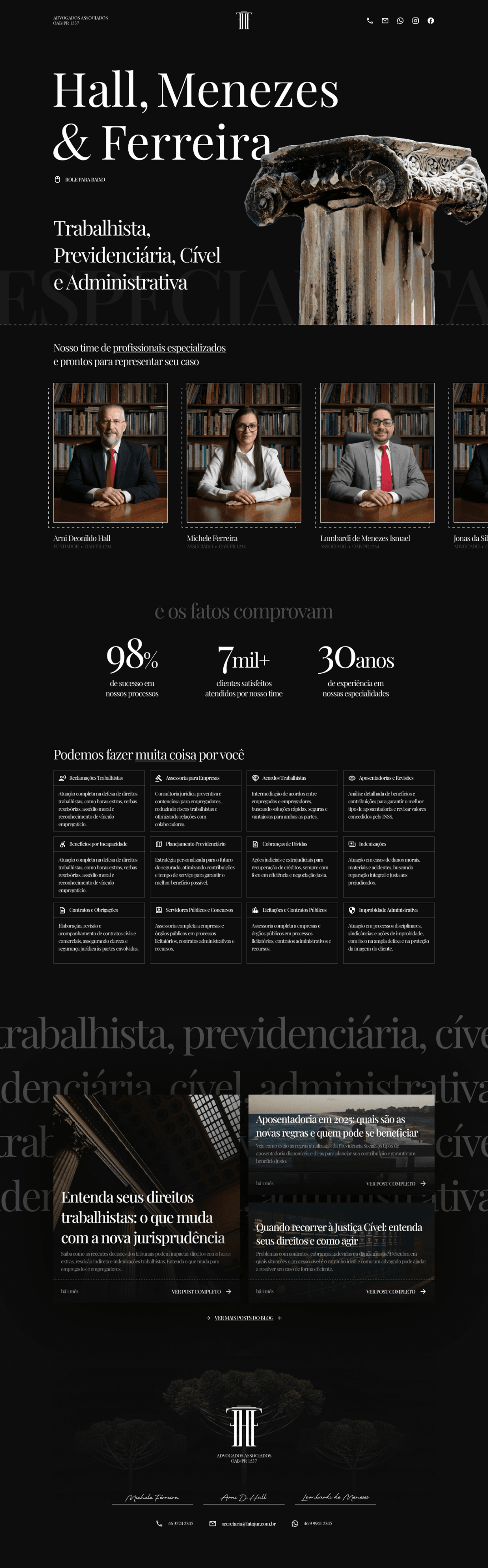
A firm's identity carries its reputation, so the brief was as much continuity as change: recognizable to the clients they already had, and unmistakably the current partnership. The logo came first and the website followed it.