How it all began
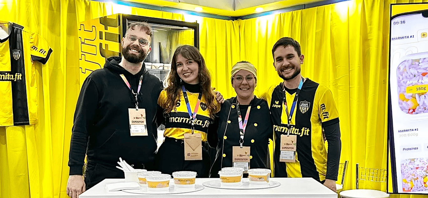
It's 2023. A fellow developer friend of mine was traveling while trying to stay on his diet. He couldn't find anywhere that would let him order meals in the exact portions he actually needed. Out of frustration, he sent us a voice message ranting about it.
That audio was the firestarter.
Together with another friend who's also a developer, we decided to just build that thing ourselves. We bought the domain marmita.fit because it was too perfect to pass up, and started out by outsourcing the kitchen and delivery to get moving fast. Along the way we brought on a nutritionist and chef as a partner, eventually invested in our own kitchen, and have been growing ever since.
Today marmita.fit has served 1,000+ customers and is pushing six figures a month. I designed the brand, the packaging and the product, built the platform end to end, and I still run it. So nothing here is a mockup or a "what if". It shipped, it works, and it's making money right now.
The website
The hero is real marmitas from our own kitchen, moving across the screen. Food is a sensory thing and a still photo just doesn't sell it. I wanted the first three seconds on the site to feel like walking past a kitchen counter instead of scrolling a menu.
Customization
This is the core of the business and the whole reason it started. Our competitors still take orders over WhatsApp with fixed, pre-made marmitas. We give people an interface where they pick exactly what goes on the plate and how much of it.
Goals & Rewards
As soon as someone starts customizing their order, a progress bar tracks their cart against R$100 (the minimum order). Instead of just blocking checkout under that number, the bar turns it into a goal to hit, with confetti when you get there.
And then it doesn't stop. The bar resets to a second goal at R$250, this time for free shipping. Two thresholds, two payoffs, both turned into little moments of feedback instead of silent rules. It's straight out of game design, progress bars and milestone rewards, dropped onto something as boring as a minimum order. It nudges cart size up and never feels like an upsell.
The Plastic Wrap
Small thing, but it says a lot about how we build here. On the cart page the UI actually "seals" the meal with a transparent plastic wrap, so you can tell your choices are locked in from there on. A tiny bit of delight that reminds you this is about to be real food, right when you're about to pay.
Dynamically Generated Thumbnails
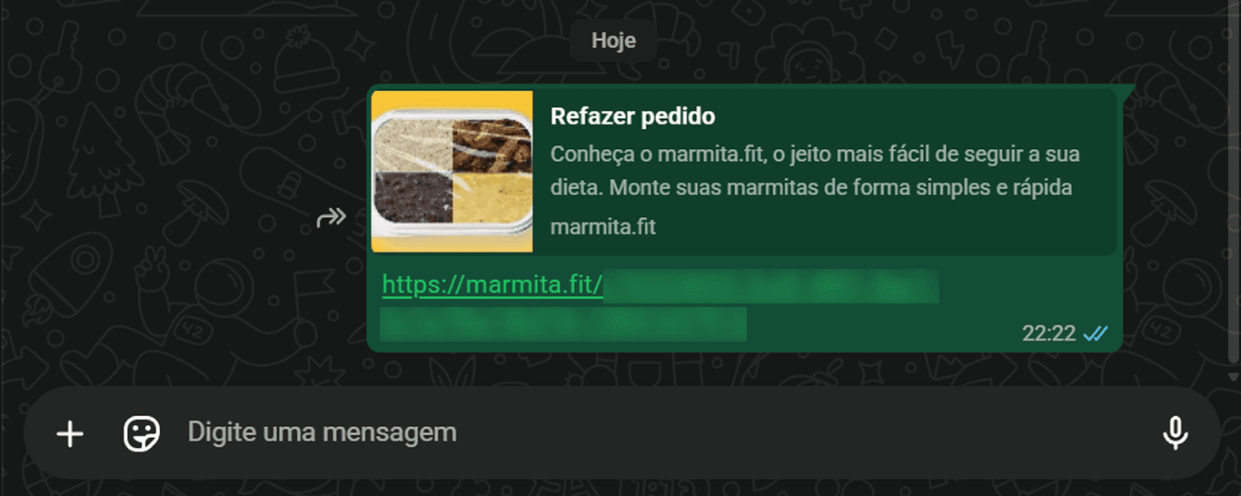
We built pre-configured marmita routes (curated combos) that generate their own link previews. So when someone drops a preset in a WhatsApp group or on Instagram, the thumbnail shows that exact meal instead of a generic homepage card. Free acquisition, which hits different when you're the one paying for the ads.
No Login Ever
The whole ordering flow, from customizing to paying, works without an account. Diet meal prep is a repeat purchase, and a login screen is the fastest way to kill it. We held that as a hard constraint since day one, and it's why buying something or finding what you need never hits a wall.
Brand & Packaging
Branding, packaging and the whole visual identity are mine too, none of it went out to an agency. Designing the physical box next to the digital product is why the brand actually holds together from opening the app to taking the first bite.
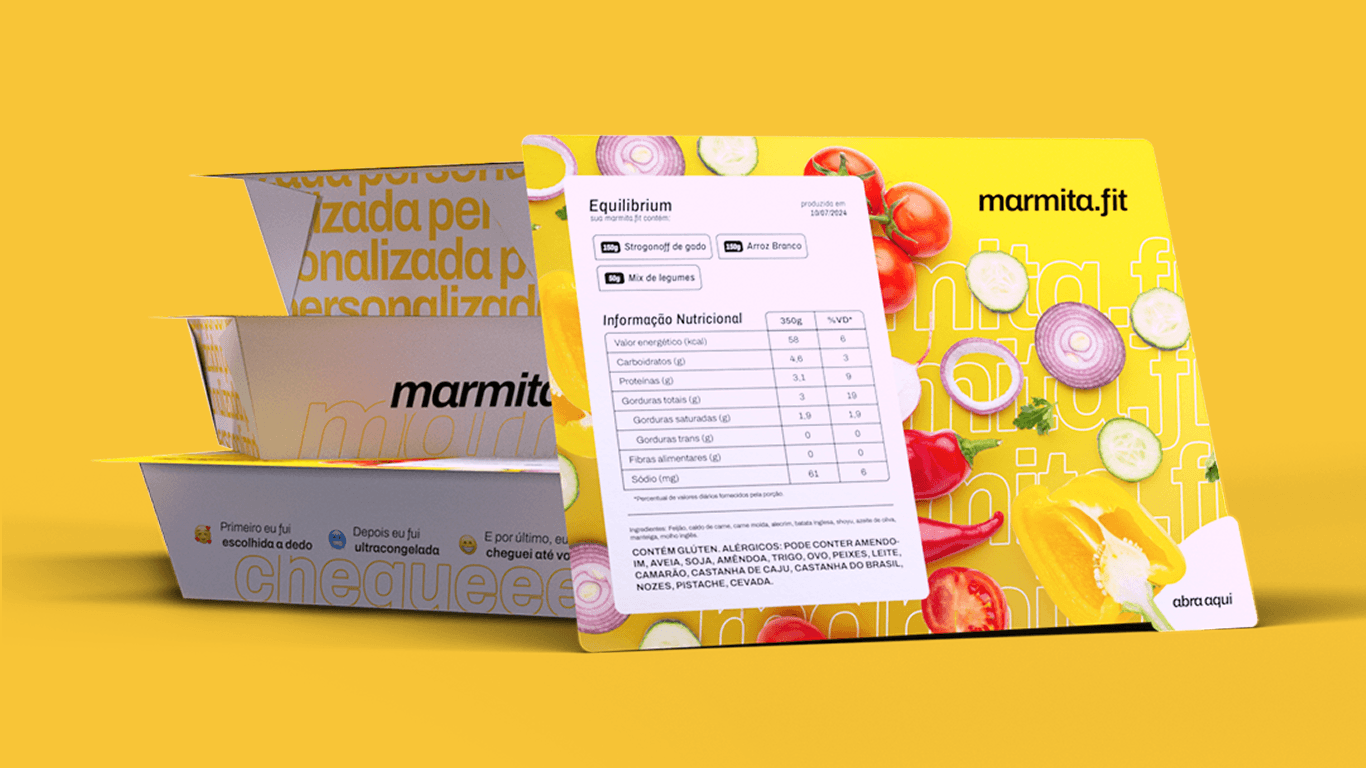
Custom Tag Generation & Printing
We built an internal tool that generates and prints custom meal tags right from the operations dashboard. Labeling, batching and kitchen logistics all run on software we wrote instead of someone doing it by hand.
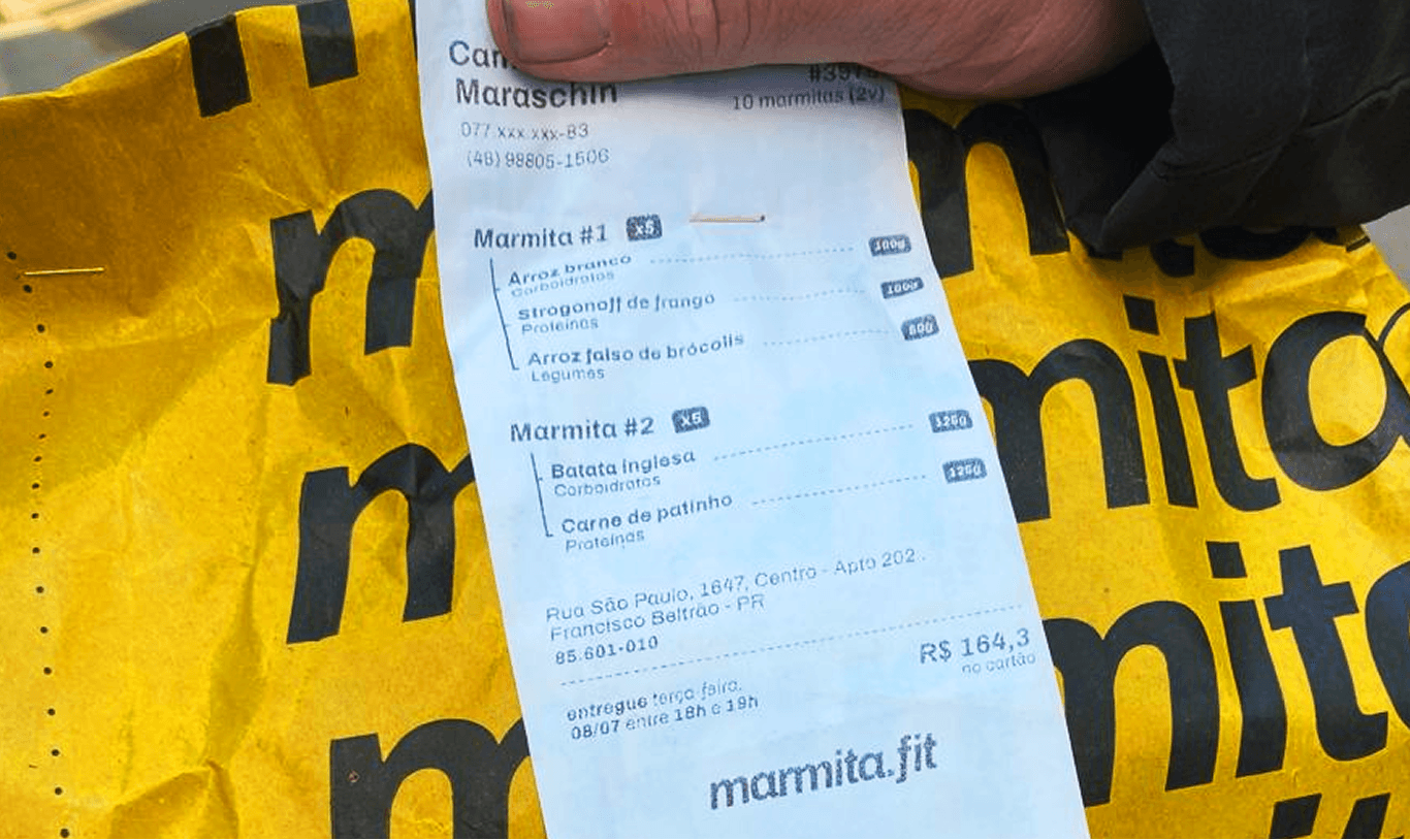
The Dashboard
A fully custom operations dashboard. Orders, kitchen workflow, tag printing, built to actually get used every day by people who aren't technical. Internal tools rarely get any design attention. This one did, because the team living in it is my own.
Ambassador Program
A way to make our customers feel special and turn them into a new source of acquisition at the same time.
Invite Letter Interaction
When someone gets invited to become an ambassador, the order page shows a little animated letter they have to "open" and accept. Turns a form into something they actually remember.
Dynamic Shareable Story
From their ambassador page they can generate a shareable story (Instagram-story-shaped) built on the fly with their own coupon code baked in. No design tool, no manual export, no waiting on us.
Trumpets & Crown
For active ambassadors, typing their CPF at checkout sets off trumpets across the screen and puts a crown above their name. It's playful, a little over the top, and exactly the kind of status moment that makes people want to keep the rank. Small mechanic, real retention.
None of this was designed in a vacuum. Every screen, animation and workflow on marmita.fit had to hold up against real customers ordering real food, a real kitchen chasing real delivery windows, and a business that has to actually make money, not just look good.
That's the difference between this one and the rest of my portfolio. I'm not showing you what I'd build for a client, I'm showing you what I built, shipped and still run, as the founder, the designer and the guy who wrote the code.