Custom e-commerces
Five years designing and building e-commerce storefronts on a proprietary platform. Here are three where I did the whole interface myself, from the first concept to the frontend that shipped.
Insana
The home page looks like a slideshow but it isn't one. Each can shows up as a bunch of independently animated parts, and the background picks up that beer's color as it lands, so the whole page changes temperature every slide.
Navigation keeps the same logic. Instead of cutting between pages, elements carry across. The can you tapped becomes the can on the product page, and the palette follows you into the catalog.
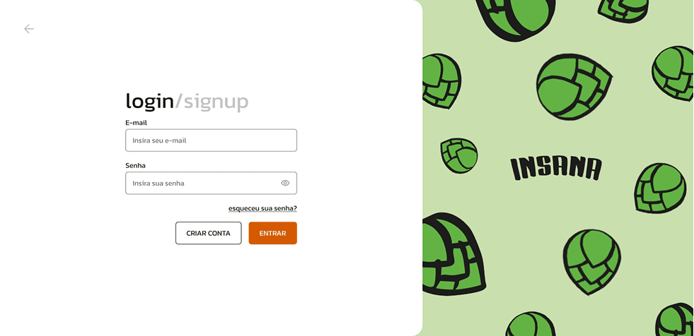
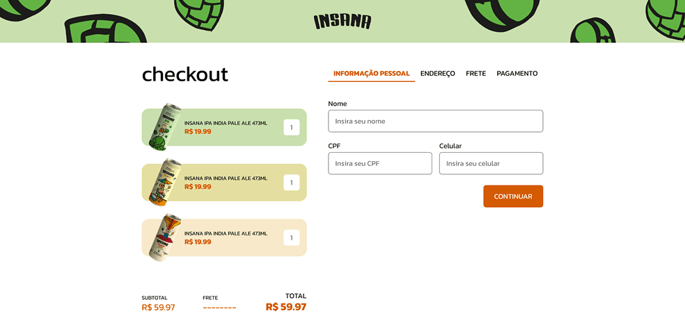
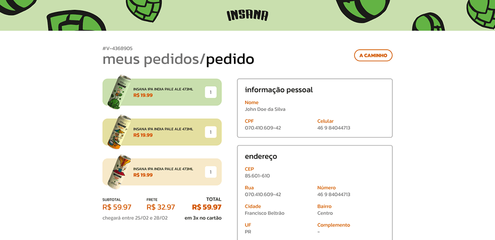
Checkout, order tracking, account and login, all built custom on the platform instead of dropped in. The parts of a storefront that usually break character, kept in it.

Receebaí
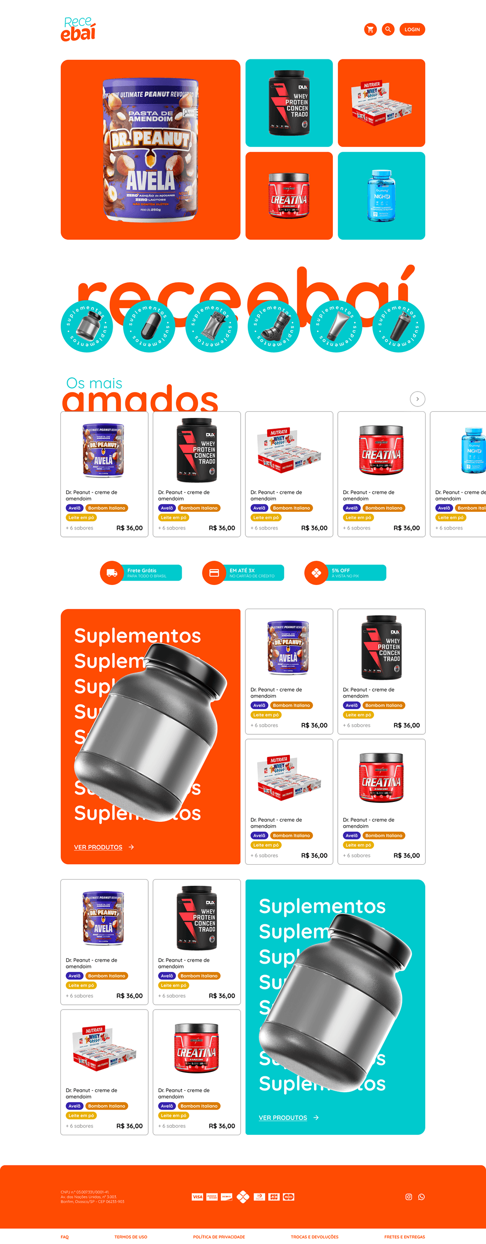
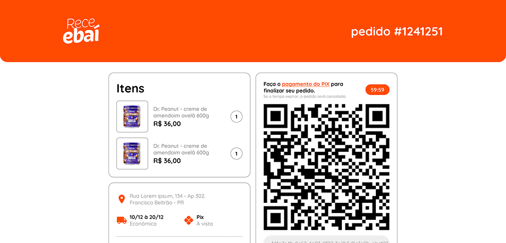
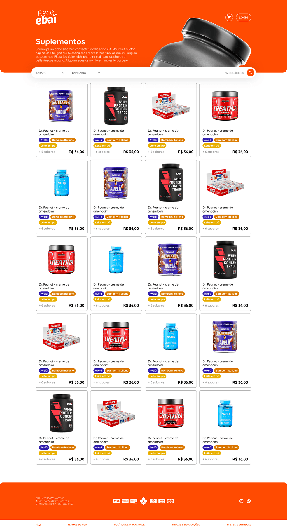
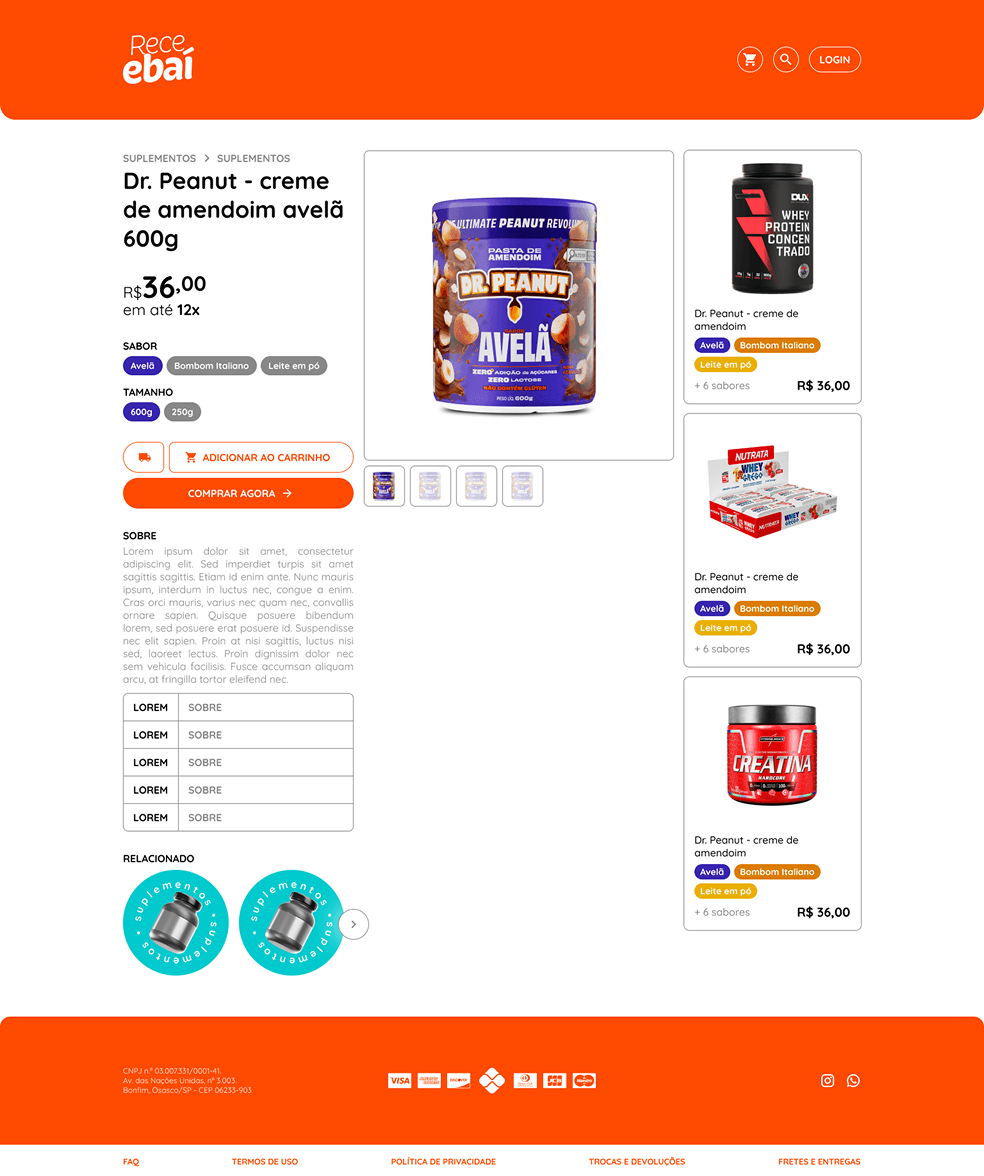
A health and supplement marketplace, custom from the home page all the way to the order confirmation. The brand's palette runs at full saturation through every screen, including the ones most storefronts leave templated.
use.moda
The home page is a video carousel, not an image one. Full-bleed footage rotates as the main navigation with type layered over it, so the interface is built around motion instead of just decorated with it.
Hover draws. Clickable text gets circled by a marker stroke that traces itself on, so the whole grid reads like someone annotated it by hand. A rough gesture against an otherwise strict black-and-white layout.
Menu, cart and filters all come in from the edges. Each one keeps the site's timing and weight, so opening one feels like part of the page instead of a panel dropped on top of it.
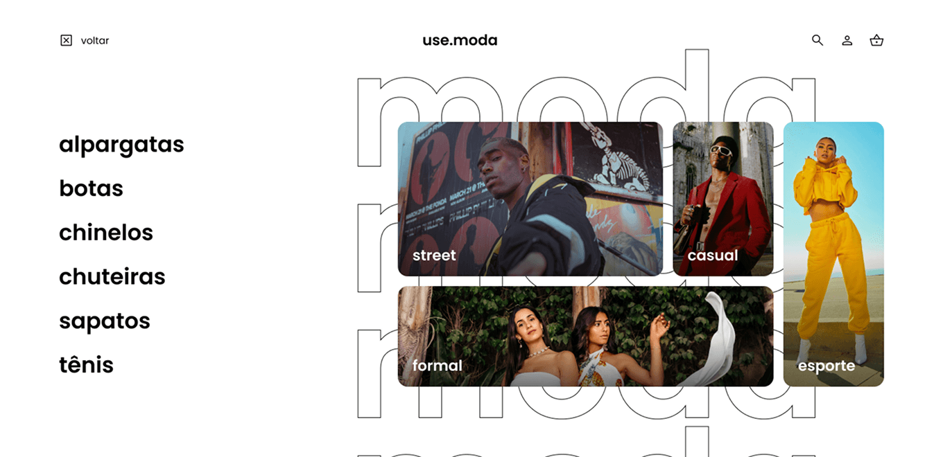
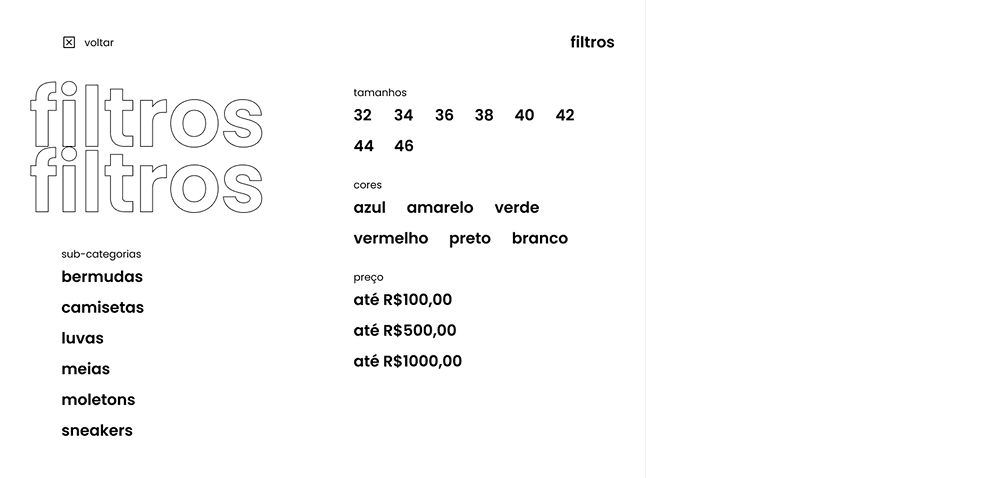

Built from scratch so the concept holds all the way through payment. Black and white, same motion language, none of the visual reset a checkout usually forces.
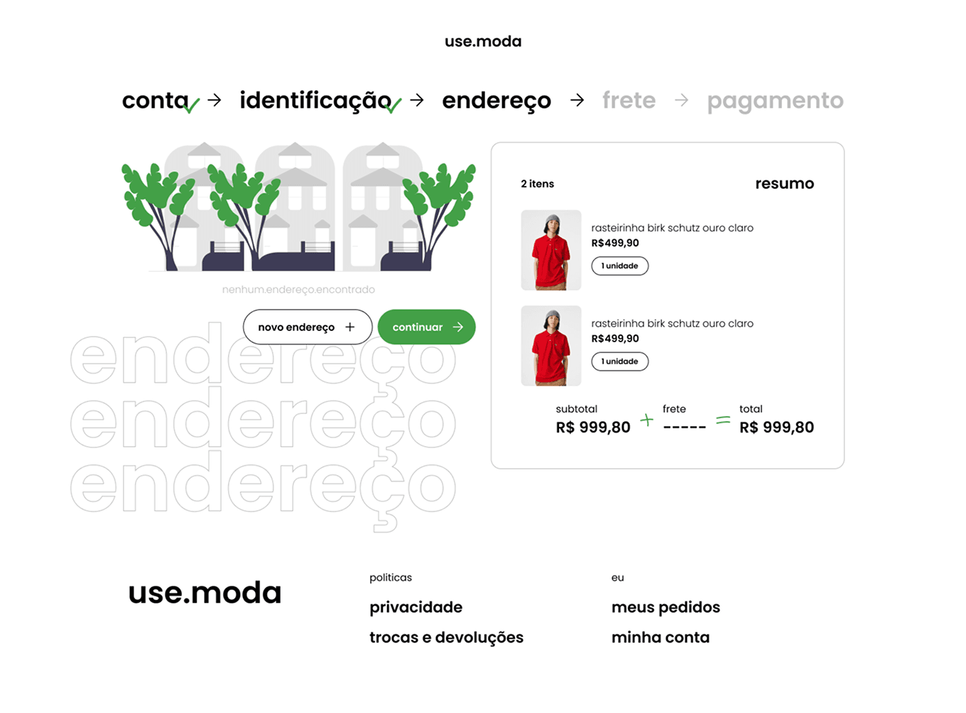
Three storefronts, three visual languages, one person on both halves of the job. I designed these interfaces and built the frontends that made them work: the animation, the transitions, the custom checkouts, all of it.
That's the part I care about. Designs that survive being built, because whoever drew them knew what it would take.